

Proficiency in front-end development is an indispensable part of the full-stack development learning roadmap. One good way to promote this proficiency, is to apply learned concepts by doing projects.
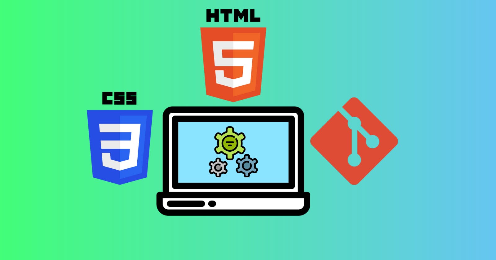
I recently did tutorials for HTML, CSS, Git and GitHub; and decided to apply and reinforce some of the things I had learned in these tutorials by building a simple webpage, tracking the process locally with Git and remotely on GitHub.
To better achieve this, I decided to use no libraries, frameworks, generators or sophisticated wireframing tools; just HTML and vanilla CSS.
The entire process was done in three main stages:
- Planning and Wireframing
- Implementation
- Hosting and Sharing
Planning and Wireframing
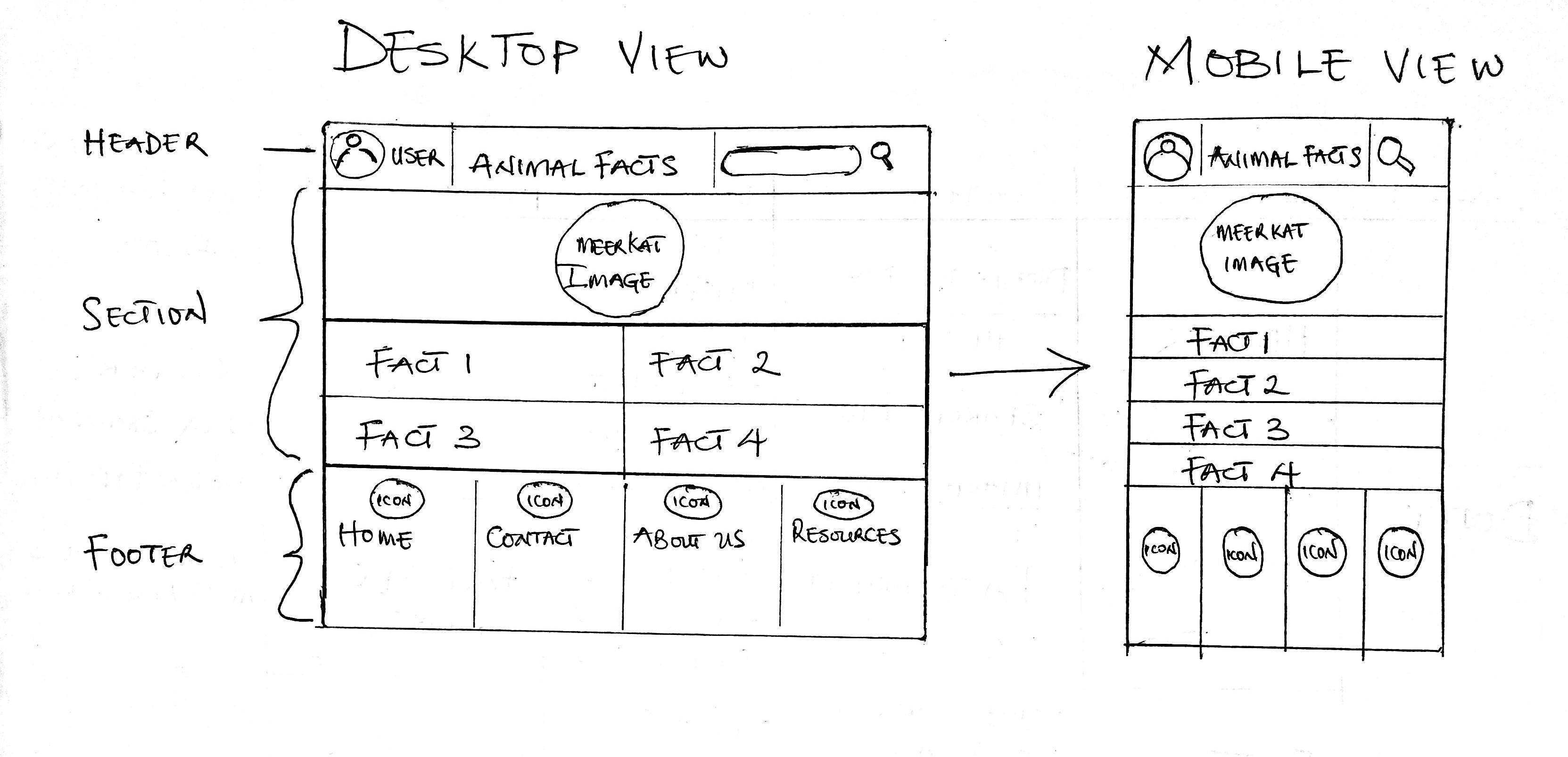
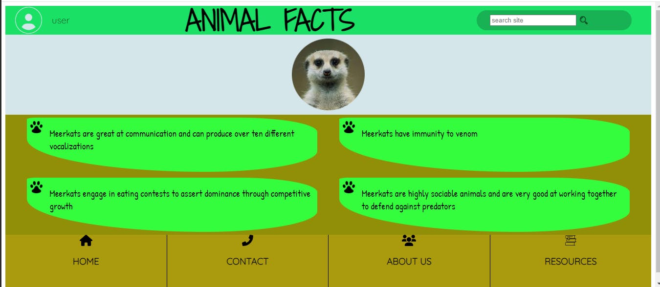
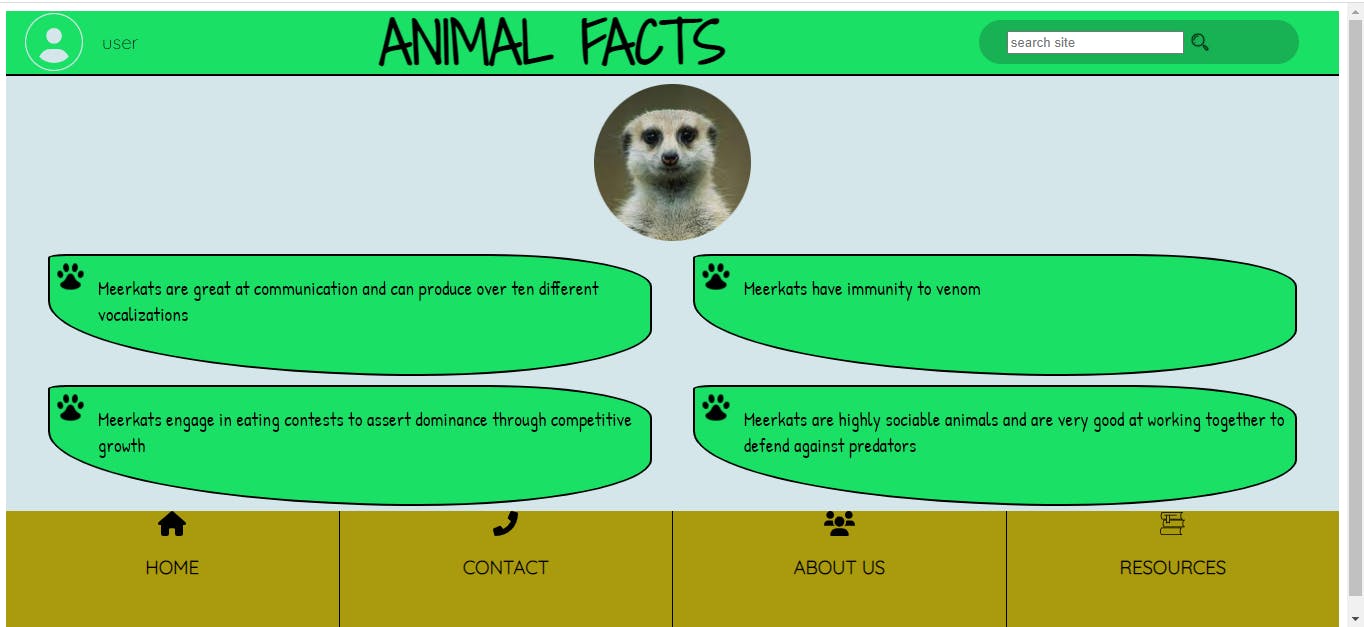
I decided the webpage would display four interesting facts about Meerkats, have three major parts within the body- a header, section and footer; and have a circular cropped image of a Meerkat.
I developed the general wireframe for the mobile and desktop views, and used a desktop-first design flow:
I subsequently divided the process of developing the wireframe, into Layers or groups of elements at the same level of the HTML document tree, starting at the topmost to the bottommost layers within the tree:
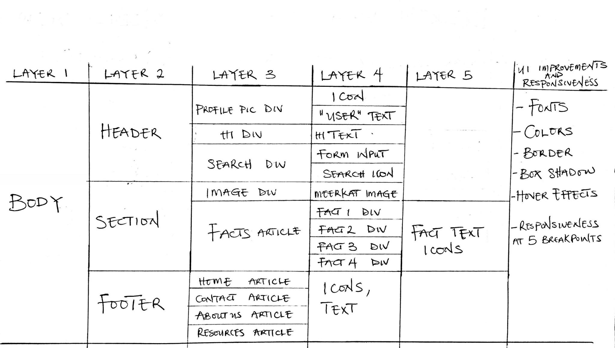
I Finally planned on improving User Interface details, adding responsiveness and committing my progress after each of these layers of development, first locally using Git, then remotely on GitHub.
Implementation
- First, I initialized a git repository in the project's root directory.
- Then I created empty HTML and CSS files and the standard HTML boilerplate with an initial title:
<!DOCTYPE html>
<html lang="en">

<head>
    <meta charset="UTF-8">
    <meta http-equiv="X-UA-Compatible" content="IE=edge">
    <meta name="viewport" content="width=device-width, initial-scale=1.0">
    <title>Meerkat Site</title>
</head>

<body>

</body>

</html>
- Next, I linked both the HTML and CSS files, commited my progress to the current Git branch and proceeded to develop the Layers
Layer 1
I started by setting the height of the body to 100% of the viewport height:
body {
  height: 100vh;
}
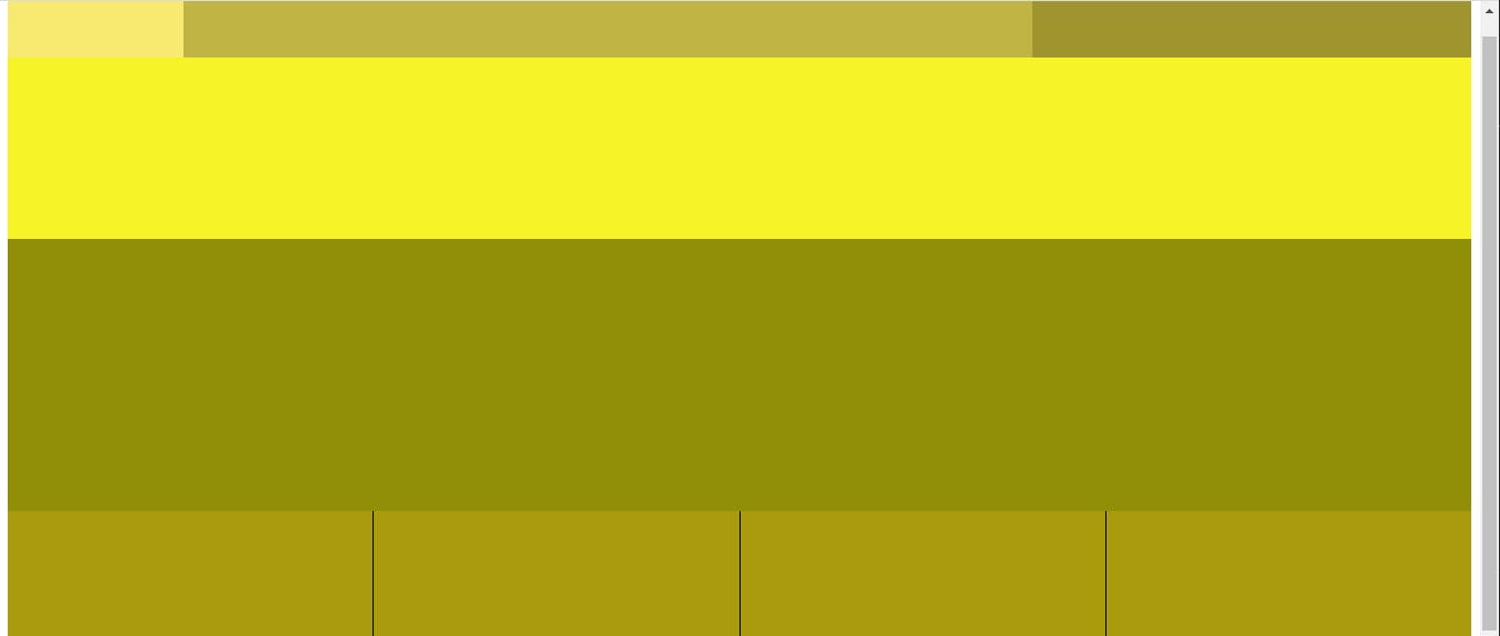
Layer 2
I set the background color of each element at this level to a shade of grey to visually aid debugging and made the following changes:
- I set the height of the
header,sectionandfooterto 10%, 70% and 20% respectively.
header {
  background-color: rgb(201, 201, 201);
  height: calc(100% * 0.1);
}
section {
  background-color: rgb(153, 153, 153);
  height: calc(100% * 0.7);
}
footer {
  background-color: rgb(112, 112, 112);
  height: calc(100% * 0.2);
}
I commited the changes.
Layer 3
I set the background color of each element at this level to a shade of yellow to visually aid debugging and made the following changes:
- For the
headerchildren, I created threedivelements, each for the profile picture data,h1text and search feature; then gave them a width of 12%, 58% and 30% respectively. - For the
sectionchildren, I created adivand anarticle, with a height of 40% and 60% respectively. - For the
footerchildren, I created fourarticleelements, each with a width of 25%.- I gave the first three
articleelements a right border.
- I gave the first three
- I commited all changes made.
header div:nth-child(1) {
  width: 12%;
  background-color: rgb(248, 234, 112);
}
header div:nth-child(2) {
  width: 58%;
  background-color: rgb(192, 180, 68);
}
header div:nth-child(3) {
  width: 30%;
  background-color: rgb(160, 148, 46);
}
section div {
  height: 40%;
  background-color: rgb(247, 243, 41);
}
section article {
  height: 60%;
  background-color: rgb(145, 142, 7);
}
footer article {
  width: 25%;
  background-color: rgb(170, 154, 14);
}
.mright {
  border-right: 1px solid black;
}
Layer 4
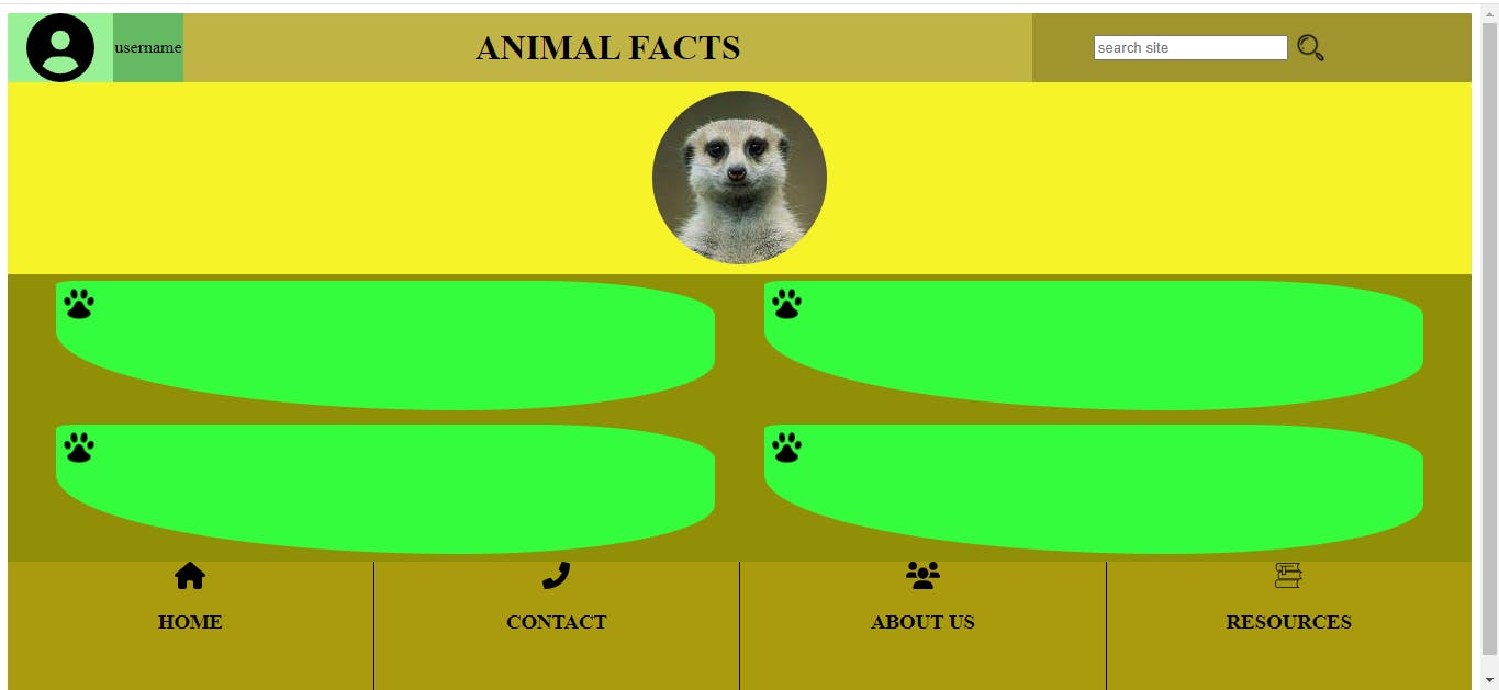
For this layer, I used a flex display for each of all the layer 2 elements and layer 3 header child elements to better aid layout design.
I also made the following changes:
- For the profile picture
divchildren, I added a user icon and a placeholder "username" text.- I experienced some unwanted styling issues at this stage, and eventually found out it was as a result of using descendant selectors instead of the more specific child combinator selectors, when defining styles.
- For the h1
divchild, I added the h1 text- "Animal Facts". - For the search
divchildren, I added aforminput field and a search icon.- I encountered some layout issues with the form content that involved visually overlapping elements. I read more about
overflowand usedflexdisplay to resolve this.
- I encountered some layout issues with the form content that involved visually overlapping elements. I read more about
- For the image
divchildren, I added a circular cropped image of a Meerkat. - For the facts
articlechildren, I added fourdivelements with definedborder-radiusvalues, that would contain the actual facts text.- I added one paw icon to each of these
divelements( I decided to do it at this layer instead of the planned layer 5).
- I added one paw icon to each of these
- For the
articlechild elements of thefooter, I included the Home, Contact, About Us and Resources text and their respective icons.- I used
flexdisplay to align them at the article container's center
- I used
- I finally committed these changes using Git.
<body>
    <header>
        <div>
            <!-- Looked up 'child selectors' to resolve an unwanted styling issue here -->
            <div><img title="username" src="resources\circle-user-solid.svg" alt=""></div>
            <div> username</div>
        </div>
        <div>
            <h1>ANIMAL FACTS</h1>
        </div>
        <div>
            <!-- Experienced some issues here regarding overflowing form content. Did a quick read on the overflow topic -->
            <form action="/search">
                <input type="text" name="serch" id="search" placeholder="search site">
                <a href="" title="Search this site"><img src="resources\icons8-search-128.png" alt=""></a>
            </form>
        </div>
    </header>
    <section>
        <div>
            <img src="resources\Meerkat (1).png" alt="A smiling meerkat">
        </div>
        <article class="article">
            <div><img src="resources\icons8-cat-footprint-96.png" alt="Paw icon"></div>
            <div><img src="resources\icons8-cat-footprint-96.png" alt="Paw icon"></div>
            <div><img src="resources\icons8-cat-footprint-96.png" alt="Paw icon"></div>
            <div><img src="resources\icons8-cat-footprint-96.png" alt="Paw icon"></div>
        </article>
    </section>
    <footer>
        <article class="mright">
            <div>
                <img src="resources\house-solid (1).svg" alt="home">
                <h3>HOME</h3>
            </div>
        </article>
        <article class="mright">
            <div>
                <img src="resources\phone-flip-solid.svg" alt="contact">
                <h3>CONTACT</h3>
            </div>
        </article>
        <article class="mright">
            <div>
                <img src="resources\users-solid.svg" alt="about us">
                <h3>ABOUT US</h3>
            </div>
        </article>
        <article>
            <div>
                <img src="resources\books-svgrepo-com.svg" alt="resources">
                <h3>RESOURCES</h3>
            </div>
        </article>
    </footer>
</body>
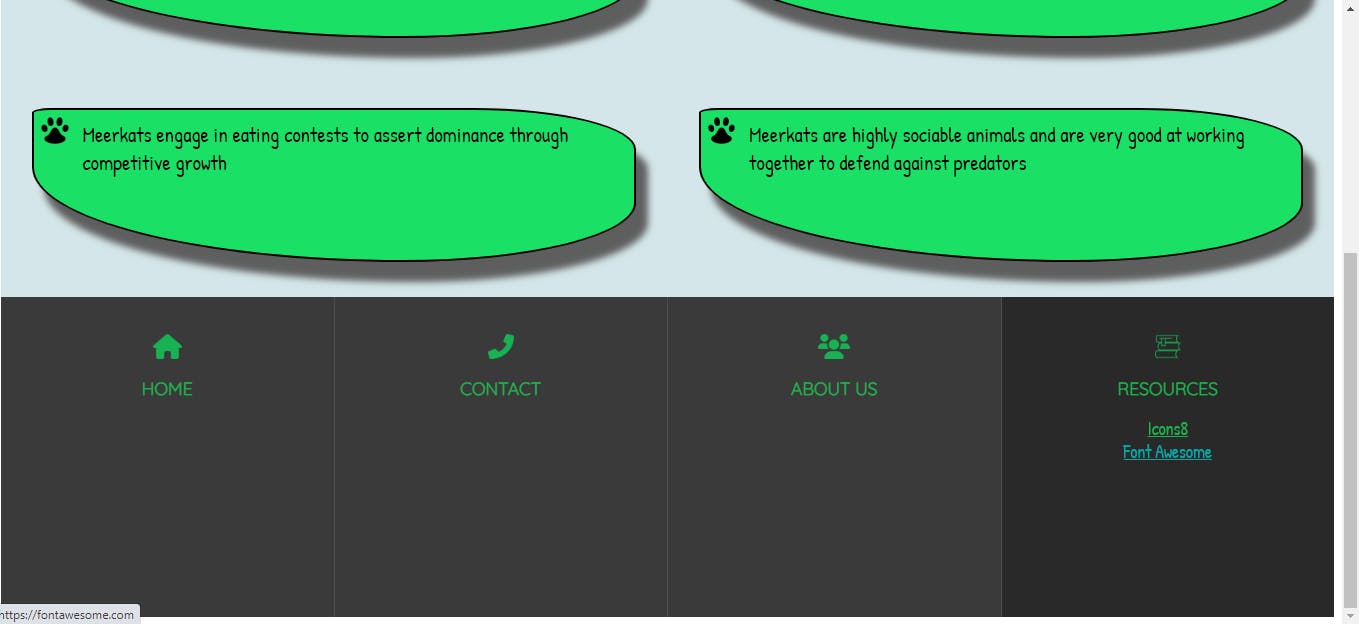
Layer 5
For this layer, I added text of four interesting facts about Meerkats to the facts div from layer 4, and thus completed the development of the HTML document tree and general layout of the webpage, according to my initial plan and wireframe.
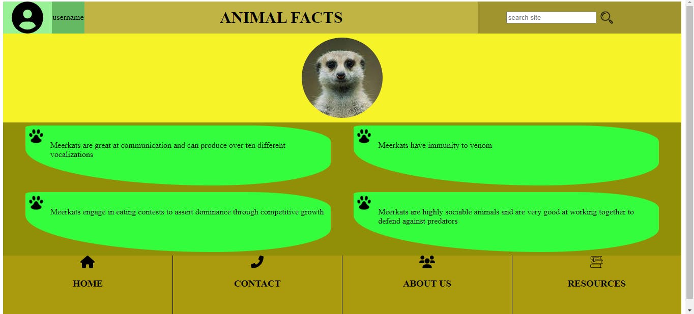 Lastly, I committed my progrees to the current Git branch.
Now to the final stage...
User Interface Improvements and Responsive Design
At this stage, I focused on;
- Adding more visual detail and design to the various elements within the webpage.
- Making the webpage dynamic and responsive to different device screen sizes.
User Interface Improvements
I made the following user interface design changes:
1.
- I changed the default font family of the
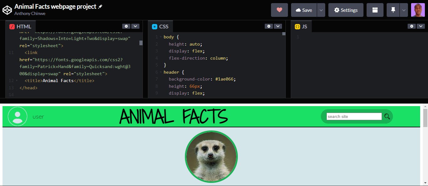
h1, facts andfooter>articletext to some families imported from Google fonts.<link rel="preconnect" href="https://fonts.googleapis.com"> <link rel="preconnect" href="https://fonts.gstatic.com" crossorigin> <link href="https://fonts.googleapis.com/css2?family=Shadows+Into+Light+Two&display=swap" rel="stylesheet"> <link href="https://fonts.googleapis.com/css2?family=Patrick+Hand&family=Quicksand:wght@300&display=swap" rel="stylesheet">
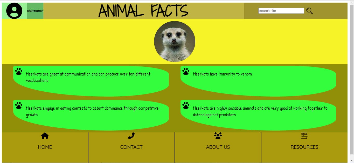
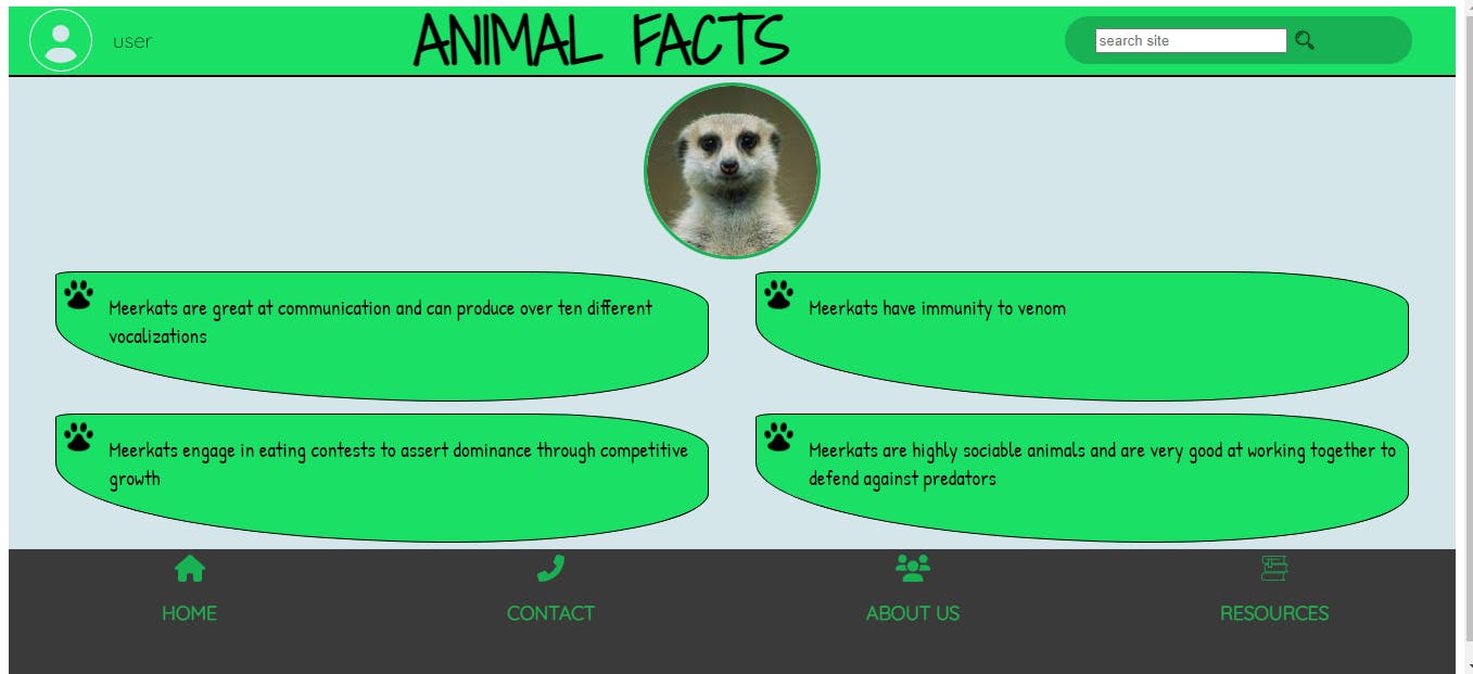
- At this point, I decided to mostly use three colors for every element;
- A fairly dark shade of green
- A very light shade of blue
- A dark shade of grey
2.
- Applied the chosen green color to the
headerbackground. - Applied the chosen light blue color to the
section>divbackground. - I changed the "username" text from Layer 4 to "user" and used a Google font for it.
- Added a
border-radiusproperty to the form element.
3.
- Applied the light blue color to the
section>articlebackground. - Added a bottom border to the
headerelement(for more contrast) and a border to all sides of each of the facts'divcontainers.
4.
- I added a border to the cropped meerkat image.
- I gave a dark grey background color to the
footer, and a shade of green to the child elements within it.
5.
- I set a
box-shadowproperty to the factsdivelements.box-shadow: 12px 20px 7px #5e5e5e;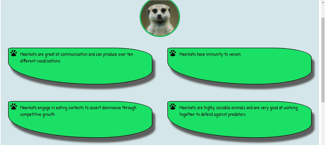
6.
- I attributed two of the websites I got icons from by adding hyperlinks, within the 'resources'
articleelement in thefooter. - I added hover effects to these hyperlinks, changing their color to a light shade of blue.
- I also added a hover effect to
footer>articleelements changing the background color to a darker shade of grey.
 Finally, I focused on making the webpage responsive.
Responsive Design
Responsive design took up almost as much time as everything else on the roadmap.
I gave the
bodyandsectionelements aheightproperty ofautoto allow them scale according to the content within them.body { height: auto; display: flex; flex-direction: column; }section { background-color: #d4e6e9; height: auto; display: flex; flex-direction: column; }I edited the
marginproperty of the factspelement so its text didn't overflow beyond its parentdivborders when resizing the window.article > div > p { margin-left: 10px; margin-right: 10px; font: 1.3rem "Patrick Hand", cursive; margin-top: 10px; }I decided to create a slightly distinct responsive layout at 5 screen
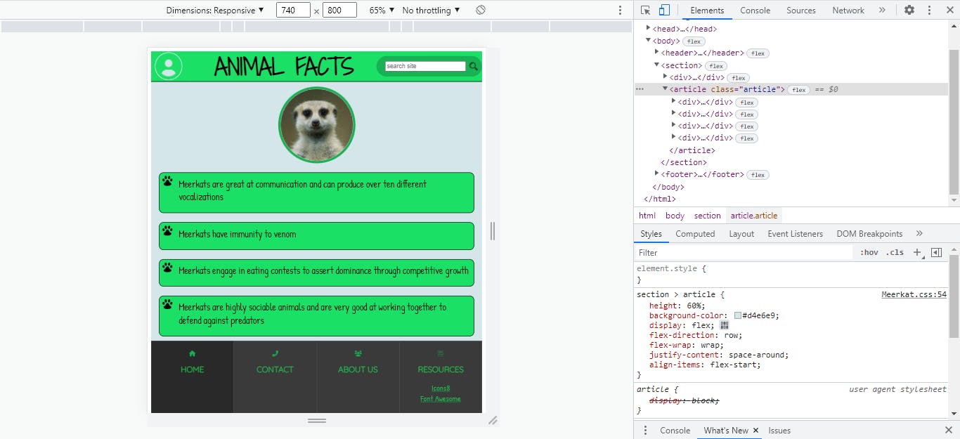
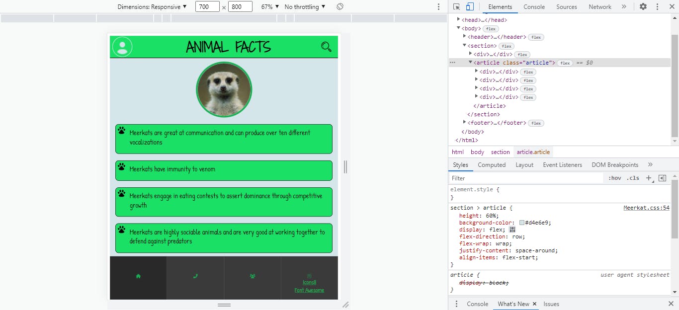
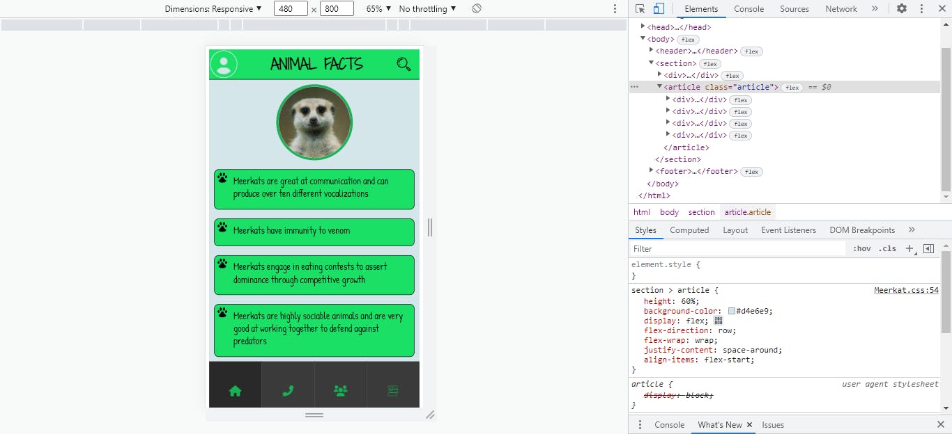
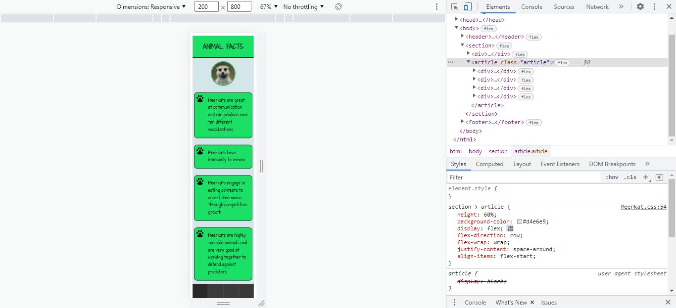
widthbreakpoints: 740px, 700px, 480px, 380px and 200px. I used themax-widthproperty.
At the 740px breakpoint;
- I made the
font-sizefor theh1text smaller - Set the
displayof theusertext in theheadertonone - Set the facts
divelementswidthto 95% to enable them stack in a column layout within the flex container
- I made the
- At the 700px breakpoint;
- I reduced the
font-sizefor theh1text - Set the
displayof theformelement in theheadertonone - Set the
displayof theh3footer elements tonone
- I reduced the
- At the 480px breakpoint;
- I reduced the
font-sizefor theh1text - Set the display of the hyperlink
aelements tonone
- I reduced the
- At the 380px breakpoint;
- I reduced the
font-sizefor both theh1and facts texts - Reduced the
heightof theuserandsearchicons in theheader
- I reduced the
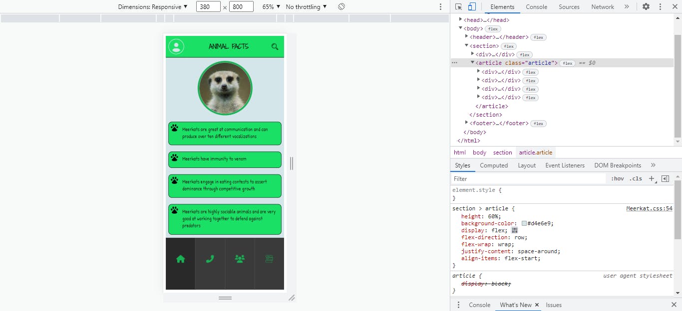
- At the 200px breakpoint;
- I set the display of the
userandsearchicondivelements tonone - Reduced the size of the meerkat image in
section
- I set the display of the
Next, I formatted and optimized my code by doing the following:
- Defined all color properties in a consistent hex format.
- Deleted unnecessary code, and abstracted repeated code snippets to classes where necessary.
I commited my progress to the current Git branch.
Hosting/Sharing
I proceeded to the final stage of the project roadmap- Hosting and sharing the webpage. It was not as straightforward as I had initially thought though(a recurring theme throughout the entire design process).
I decided to share the webpage on two plaforms: GitHub and Codepen.
GitHub:
- I created a remote repository on GitHub for the project.
- Next, I linked and pushed my local Git repository to the remote GitHub repository.
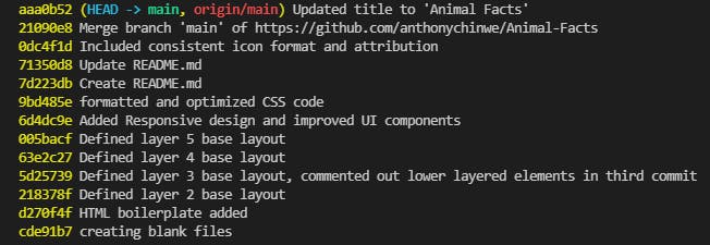
In the end, my Git commit history looked like this-
Codepen:
- I created a new empty pen.
- Next, I copied and pasted the entire project codebase into their respective language editors, in the empty pen.
- As I didn't yet have access to the asset hosting feature, I decided to host the icons and image on a third-party image hosting platform. However, this platform didn't allow SVG file type uploads(for security reasons, I gathered), so I had to convert the SVG icons to the acceptable PNG format, and refactor the codebase accordingly.
Conclusion
So with that, after about 400 lines of code and just over a month, I had completed the webpage project I initially set out to do.
The entire process was a valuable learning experience- I had practiced and better explored the following concepts and topics:
- Semantic HTML
- HTML document tree/structure
- Problem solving
- Planning/wireframing
- design workflow
- Accessible design
- CSS box model
- Responsive design
- Debugging
- Refactoring and optimizing code
- Working with Git and GitHub
- Hosting and sharing codebase
- Relative benefits and security risks of certain file formats